


Passion Project
Fictional Perfume Brand
To gain more experience with my marketing, logo design, branding, social media graphics, and packaging design I created a fictional perfume brand.
To start, I researched and decided on what I wanted my perfume brand to be. I knew I wanted my perfume to be heavily based on vanilla scents, so I chose the name: Vielle Vanille. A boutique fragrance house based in Grasse, France, that specializes in "Aged Extraction." Unlike mass-market perfumes that are bottled immediately, Maison de Vielle allows their vanilla tinctures to macerate in French Oak barrels for 24 months before bottling. They treat the scent as a "vintage" rather than a seasonal trend. I then figured out who my target demographic was: women aged 40–65; high-disposable income; likely homeowners in metropolitan or affluent suburban areas. They value "slow luxury" and sustainability. They are tired of "sugary" vanillas and are looking for something that feels like an heirloom. They appreciate "storytelling" in their purchases and are likely to enjoy fine dining, wine tasting, and gallery openings. Next I had to figure out who my competition is. For niche luxury my competition is: Tom Ford (Tobacco Vanille), Byredo (Vanille Antique).For heritage brands my competition is: Guerlain (Spiritueuse Double Vanille), Diptyque (Eau Duelle). Next I curated a business strategy. My position was to be the "Grand Cru" of Vanilla. Distribution will be in high-end department stores (Nordstrom, Neiman Marcus) and exclusive boutique pop-ups. Pricing would be roughly $180-250 per 50ml. My marketing hook is, "Aged to perfection, worn with distinction." Each batch is numbered by the year the beans were harvested and the year the maceration was completed. This encourages "collecting" different vintages to see how the scent evolves.
Putting Together the Design
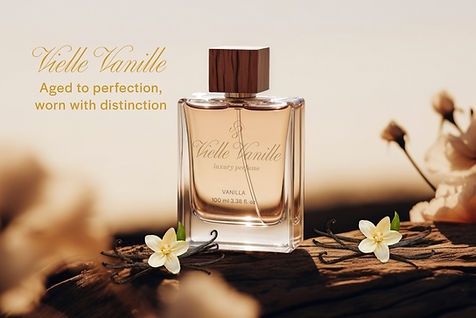
After finishing my research, I started logo design. I knew I had wanted to do a luxury script logo design. I put it together and edited the font until I felt it represented my brand. I then made an icon combining the script elements of the "V's." I decided on my brand colors to be gold, burgundy/brownish, and black. I wanted my fonts to have a script and then a sans serif font as well. I then jumped into packaging design. I wanted it to feel like it was luxury so I kept it fairly simple. Then I made a social media graphic. I wanted the words to be minimal and to really focus on the perfume bottle.

Overall Experience
I learned a lot and grew my knowledge and experience in branding, packaging, marketing, social media graphics, and logo creation. I had a lot of fun with this project and am proud of how it turned out.